Medical records in. Reports doctors trust, out.
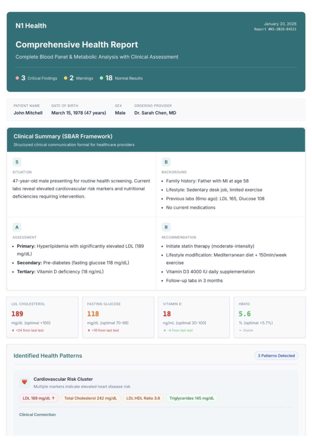
N1 Care turns fragmented medical records into structured, editable health insight. A clinician uploads PDFs and images, the AI extracts biomarkers, diagnoses, genetics, procedures, and medications, and the clinician reviews everything before a Comprehensive Health Report reaches a patient.
I was the only designer on a 23-person team for about seven months. Product, brand, design system, documentation: all of it went through me. The core rule I designed around: AI supports the doctor's judgment, it never replaces it. Nothing reaches a patient without explicit clinician approval.
- Medical recordsUpload flow, AI extraction states, classification review
- Biomarker trackingTrends over time, reference ranges, comparisons, alerts
- DiagnosesICD-10 coded, active / resolved / chronic tracking
- ProceduresCPT coded, provider and facility history
- GeneticsSNP interpretation, pharmacogenomics, carrier status
- MedicationsDosage, interactions, complete history
- CHR reportsThe flagship: AI-drafted, clinician-approved patient reports
- Patients, billing, onboardingMulti-patient accounts, Stripe credits, a 17-step guided tour
Under it all: a design system built from zero. 80+ components, 64 custom icons, 86 documented colors, every state designed, from empty to error to returning-user.
The Comprehensive Health Report is the product's whole reason to exist, and the highest-stakes screen I have ever designed: an AI-generated medical document that lands in a patient's hands.
I ran 8 visual experiments (from minimal clinical to high-contrast accessible, which hit WCAG AAA), then wrote a 28-point quality checklist that every report passes before a doctor can send it. Wrong value, missing section, judgmental tone: the checklist is the gate between AI output and a patient's eyes.
The platform and the report got two deliberately separate design systems. The app is clinician-facing: modern, teal, Inter. The report is patient-facing: navy, document-like, built to feel like something a hospital would stand behind. Same product, two different emotional needs.
Why two separate design systems?
Clinicians need a fast working tool. Patients need a document that feels safe and official. Serving both with one visual language would have made both worse.
Why a 28-point checklist for AI reports?
Without a systematic gate, important things slip: a wrong value, a missing section, a tone that reads as judgment. The checklist made quality repeatable instead of heroic.
Why interactive HTML prototypes instead of static Figma?
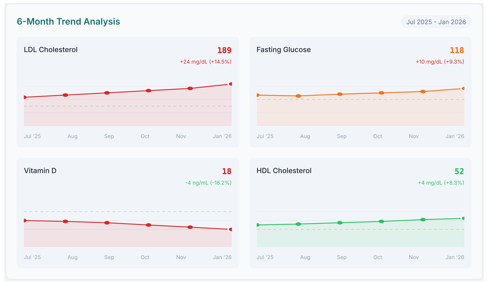
Charts and comparisons only make sense in motion. Engineers needed to see behavior, not layout. Working prototypes cut the "what should this do?" back-and-forth to almost nothing.
Why 45 chart types?
Different biomarkers tell different stories. A trend, a category, a range all read differently. Building the library once stopped every engineer from solving the same problem five ways.
- -75% report generation time
- -50% dev implementation time
- 26 documentation files shipped
“Outstanding job! In just one week, it felt as though we had been working together for over a month.”Jasper Middendorp, Engineering Lead